“90% of information transmitted to the brain is visual and visuals are processed 60,000 times faster than text.”
Seriously, if you were looking at an image right now, instead of reading this text, you’d have already seen it, processed it, and moved on.
What’s more?!
- 80 percent of people remember what they see
- 20 percent remember what they read
- 10 percent remember what they hear
Images are more powerful than you might think.
As an eCommerce store, the better your products appear on your website, the more you will sell. After spending many hours visiting eCommerce sites, and across multiple industry sectors, I’m surprised that still there are so many eCommerce sites with poor or limited product photography… For example, a premium sports goods retailer’s nicely-designed website featured a nice pair of running shoes, on sale for S$130. When I reached the product page I was astounded to be presented with a single side shot of the shoes. What is the shoes’ toe shape when I look down on it? What does the insole looks like? What is the outsole pattern? All these important questions went unanswered, to find out more details of this product, i will have to Google this product, and end up, I bought the shoes from another online store which provides more shots and cheaper price, although the site design is not as good as the site which lost the business.
Your products are the backbone of your business. If you don’t put effort into their appearance, customers’ perceptions of your business as a whole will crumble. Look at it this way. When shopping online, your customers can’t physically touch or experience your product before making a purchase. So, how do they make purchasing decisions? For the most part, based on product photography. In a nutshell, that’s why your product images are so important.
How can you make sure your product photography is up to par? Below are some great tips that might help:
Lighting is the Key
Do you ever wondering why the furnitures looked so good in IKEA, but when you buy them home, hmm… it doesn’t looked so cozy anymore?
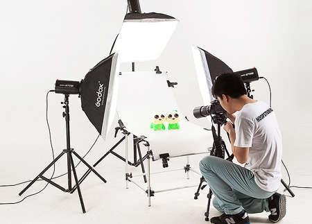
Never underestimate the power of good lighting. It’s the most critical aspect when it comes to photography. It sets the tone, mood, and atmosphere, and provides product clarity and accuracy for the customer.
While natural light is the best choice for some products, those with lots of details often need light sources to be manipulated to truly show the features accurately. A professional will know which is best to use.
Background.
You want your product to be center of attention in your photographs. Choose a simple background that helps your product stand out and doesn’t distract the viewers. Plain colored backgrounds are usually best, but sometimes products need to be shown in a real-life setting or situation. In this case, make sure that your product is still the main focus and that the background isn’t too distracting.
Details and Features
Show close-up detail shots, especially if selling premium quality items, to draw users’ attention to key features such as fabric weave, special features, branding or other detailing. These shots are an effective way to communicate the unique qualities of any products that may be difficult to describe with copy.
The majority of products featured online come in different colors, sizes, models, etc.; just listing these different styles isn’t always enough. Customers are going to have a harder time visualizing themselves with the product without seeing it in the specific color, size and or model they want. No one likes surprises when ordering specific products; multiple photos of each option available will increase customer satisfaction as well as their loyalty to your business.
Consistency
You want everything on your site to flow, so when it comes to product photography it’s important to keep it consistent. Choose a uniform background so that everything flows naturally and is aesthetically pleasing. A different background setting for every product can look cluttered and be overwhelming for viewers. The number of images for every product should be as consistent as possible too. As a general rule of thumb, try to show three – four photos for each product.
Think as the Customer
Consider key angles for each product, for example the toe shape for a pair of shoes, the inside of a handbag or the back of a jacket. It’s important to understand the needs of customers during their decision-making process; multiple product shots show customers that an eCommerce site is working hard to address these needs, with the aim of making their buying decision as easy and straightforward as possible
Hiring a professional company Vs taking your own product photographs
A lot small and medium business owners usually think why would pay someone to do something that they themselves are capable of doing? But you have to understand the time and money commitment, especially if you aren’t familiar with using a high quality camera and all the expensive equipment it comes with. Take a look at this pro/con list to decide which direction you should go.
It’s time to assess your product photography. Is it attracting customers or driving them away? Is it boosting conversion rates or diminishing them?
Get a leg up on competitors by transforming your product photography. Good pictures lead to more traffic, more conversions, and happier customers.
Visual elements can answer questions without words and make your business memorable. You can’t afford to neglect product photography; your eCommerce success depends on it, if you need a professional product photography service for your eCommerce business, kindly check out our service https://www.hoopstudio.com.sg/product-photography/


